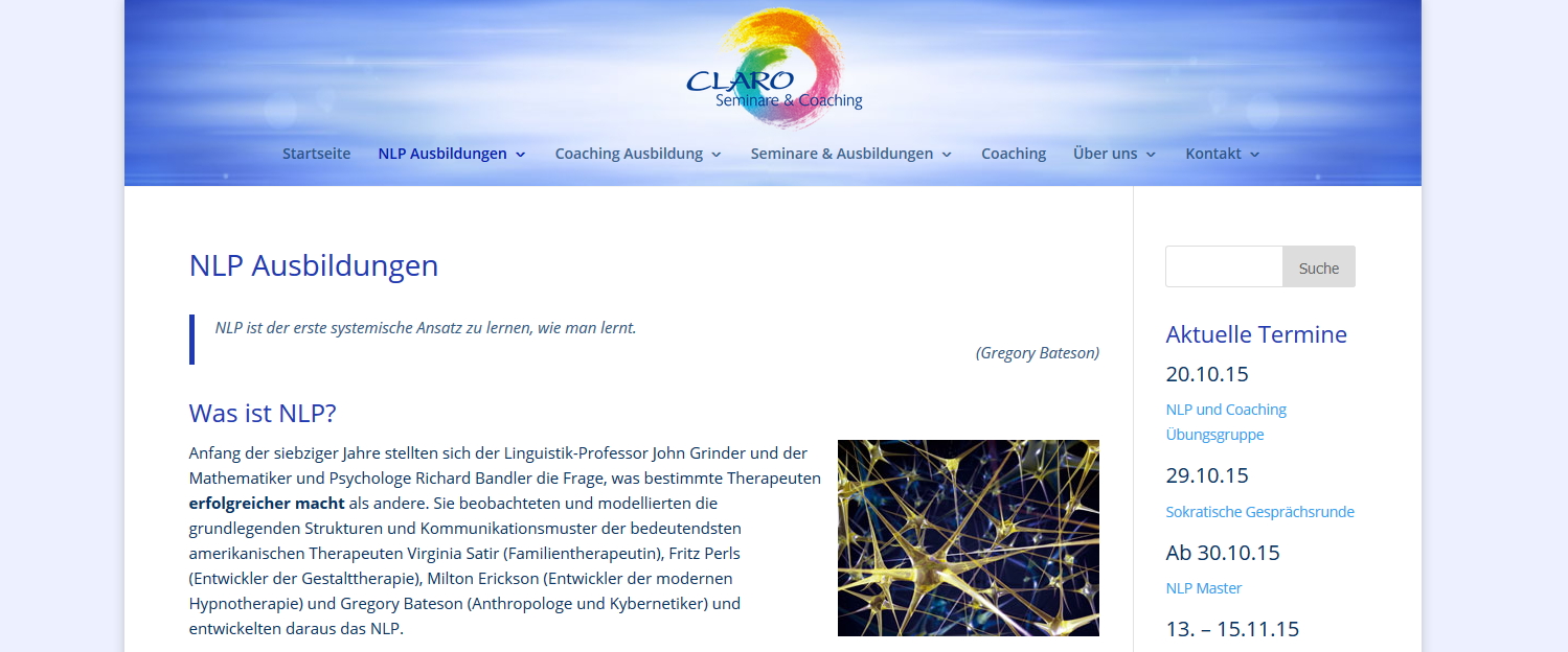
When I worked today on the relaunch of an old non-responsive website into the DIVI Theme, I did something that made me WOW with just one line of CSS code: A background-image in the header area with a transparent logo on top – fully responsive and simply delicious:

You might find the site still in this design on claro-seminare.de, depending on how far 2015 has meanwhile passed :) If so, then also check the responsive behaviour: The logo is a transparent .png, the background always covering the header area in all resolutions.
How was it done?
As said, one line of custom CSS code basically (besides uploading the logo as transparent .png format in the theme options):
|
1 |
.et_fixed_nav.et_boxed_layout #page-container #main-header {background:url(http://domain.com/wp-content/uploads/header-divi.jpg) no-repeat center center; background-size:cover} |
And two useful settings to give the logo more size and space than it has by default:

And that’s it.
Time has passed and it is not working any longer in the actual version of DIVI? Any other feedback? Please share your comment.


hello, where do you put that code? in ths style.css or somewhere else?
I just copy and paste the code and dont work :(
BTW im using divi 2.7
Rodrigo.
Yes, in the style.css of your child-theme or into the Custom CSS box in the DIVI options. Make sure you change the jpg path correctly to yours.
It looks great. But it doesnt’ show on my page.. I have changed the jpg path..
How do you arrange the logo centred and above the navigation? Thanks, Birgit
Hey Birgit, did you fix it meanwhile?
Hi Sofian – Yes. I managed to fix it. Do not remember how though :-)
Nice, thanks for posting this. It didn’t work on my page at first, but then I removed the reference to “.et_boxed_layout” (because I was not using “boxed layout” and it worked.
Thanks for doing this tutorial, however I am unable to get this to work in my Divi site.
Where am I calling the URL image out from? I uploaded the image to the media files in my site, and I am using the URL from that in the code. Is this the correct way to do it?
Thank You!
You need to replace the URL from my example code with the one to your image. You find the URL of your image in the media library when clicking on the image, in the right sidebar. Copy from there and insert into your CSS.
Hi,
This should help – works on my divi theme …
#main-header::after {
content: “”;
background-image: url(type your image pathway here/image.jpg);
background-size:cover;
top: 0;
left: 0;
bottom: 0;
right: 0;
position: absolute;
z-index: -1;
}
Has anyone been successful using this in 3.0? I have a logo I want to span the entire background and then I’ll try to use a transparent .PNG logo to mimic the clickable logo area. Sounds kind of Mad Max when I write it out, but seems doable.
Hi Jerry did you manage to come up with a solution, as I’m trying to do the same
Hi,
thank you for this post.
But for some reason it doesn’t work on my website.
I did the copy/paste and replaced the URL, but unfortunately …
Can someone help me on this, please?
Thank you! I just got this to work in the latest version of Divi by using in the Divi theme options CSS box:
#main-header {background:url(http://your file path here.jpg) no-repeat center center; background-size:cover}
The website is looking good! Thanks for sharing this info! Very helpful :)
you are beautiful! Thank you. So simple and DIVI help sent me this head-spinning article – https://css-tricks.com/responsive-images-css/
You did it so perfectly. I will have to let them know that you are the bomb!
Thanks Lois for all those compliments, glad it helped you.