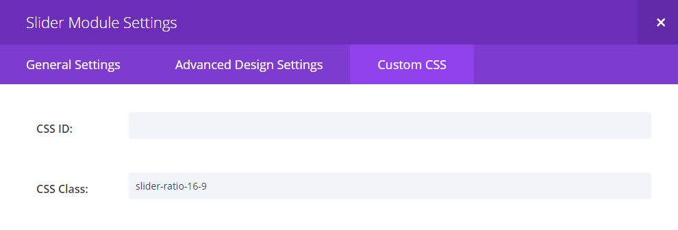
Responsive slider images are an art in itself, and usually they get cut, clipped or cropped on top, bottom, left, right or all around while the browser window size changes. Responsive slider images need to take that behaviour into consideration, but sometimes we simply don’t want even one pixel to be stolen, e.g. if we place text or a logo directly into the image. In DIVI it is easily possible with this little CSS customization – the famous padding-bottom trick. First assign a class to the slider (in its “Custom CSS” section), e.g. slider-ratio-16-9, and use the following CSS code:
|
1 |
.slider-ratio-16-9 .et_pb_slide {padding: 0; padding-bottom: 56.25%; height: 0;} |
The percentage of 56.25% is the ratio of 16:9, if you have e.g. a 1920x1080px image size (1080/1920*100). If you use other dimensions, you need to adapt the percentage accordingly. All slides need to have the same ratio, otherwise the bigger ones will be cropped again, even if at least in a controllable way. Also works with fullwidth sliders.
ENJOY the joy of uncropped sliders!


This is the best thing I have found all year! I’ve been struggling with the slider sooo much, I hate them, they could be so much better. Thank you so much!
THANK YOU SO MUCH!!! Took me hours or trying other solutions to no avail… and then this… 3 seconds later… bam!
Soo cool, thanks.
Works well. Thanks
Thank you! Easy fix and worked perfectly!
10,000 Thank Yous :)
Omg! you made my day, thank you soooo much!!!
Does this still work? Maybe I am putting .slider-ratio-16-9 .et_pb_slide {padding: 0; padding-bottom: 56.25%; height: 0;} in the wrong place?
Hey Catherine, has been a while but yes this still works. I guess you fixed it meanwhile.
Thank you so much and this is super simple. All the extra crap options that Divi has and you still can’t make a slider responsive. I’ve still not found any use for all the additional features that are so confusing.
Thank you bro!
it works perfectly.
I noticed that in front-end visual builder the slider get a odd height and cropped, but when you leave the builder it looks perfect.
I fixed it setting the “max height” to a static value (550px) and it still works good.
Hi,
This is excellent, thank you for this.
What exactly causes this to work? I’m struggling to get my head around what exactly the issue was that caused this previously, I’m so grateful for the solution you’ve provided.
Hey Richard, it’s the padding that does the trick. It goes straight for the percentage, very precisely and reliable, which could not be achieved with the height attribute itself. So there’s the magic, the height is given by the bottom padding exclusively on an otherwise 0px high container.
This is amazing! I have struggle with this for years. The only issue is if you have a bunch of text on the slide, it will run off the bottom when you resize. Since I only have one line – I’m good. Thank you!
Glad to hear Debra. Haven’t used the code myself for quite a while, but if I will ever get on it again, will take a look if this can be improved.